With any Apple-related topic, there is no shortage of opinions. Most of them are rushed, sensationalistic, and not worth anyone’s time—they’re just there to attract pageviews and boost ad revenue. Then there’s the small segment of thoughtful and nuanced pieces that are actually worth your time.
In any case, with this flood of opinion, you can be sure the “correct take” is hidden in there somewhere. However, with the iPhone X notch, that doesn’t seem to be the case.
So here’s my take:
There are two common arguments against the notch. The first is that the notch is awkward in software. It stands out in iOS’s all-white interface. And it’s there, awkwardly lurking, in landscape when you watch videos and when you browse the web.
The problem is, the people complaining aren’t using the actual device, they are watching screen recordings from emulators. One thing with we learned from the Essential Phone, which also has a notch, is that users stop seeing it within hours. It’s just like how people with glasses don’t see their glasses frames. The notch being an annoying eyesore is not an actual problem.
That’s not to say the software treatment of the notch is perfect. There are many rough edges and some things are downright inelegant (like landscape web browsing), but it’s important to remember that Apple has total control of the iOS interface. They’re already changing things, and the interface is only going to get better from here.
The other argument is that the notch is ugly. Why not just cover up the sides and hide it?
The ugly argument is hard to rebut because aesthetics is subjective. Personally, I think the notch is beautiful and the notch serves a strategic purpose.
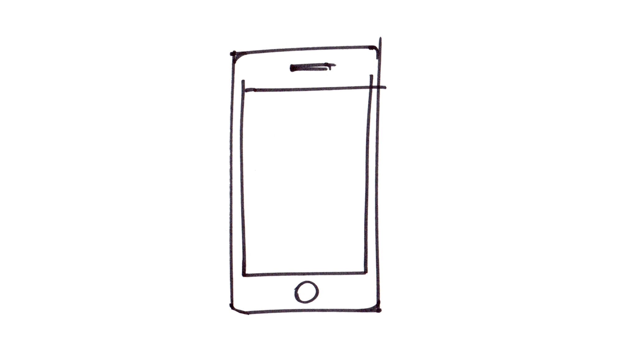
The iPhone has always been iconic. Ask anyone to draw an iPhone and they’ll draw a rectangle with a home button.
Now, ask people to draw an Android phone, and you won’t get a consistent result.
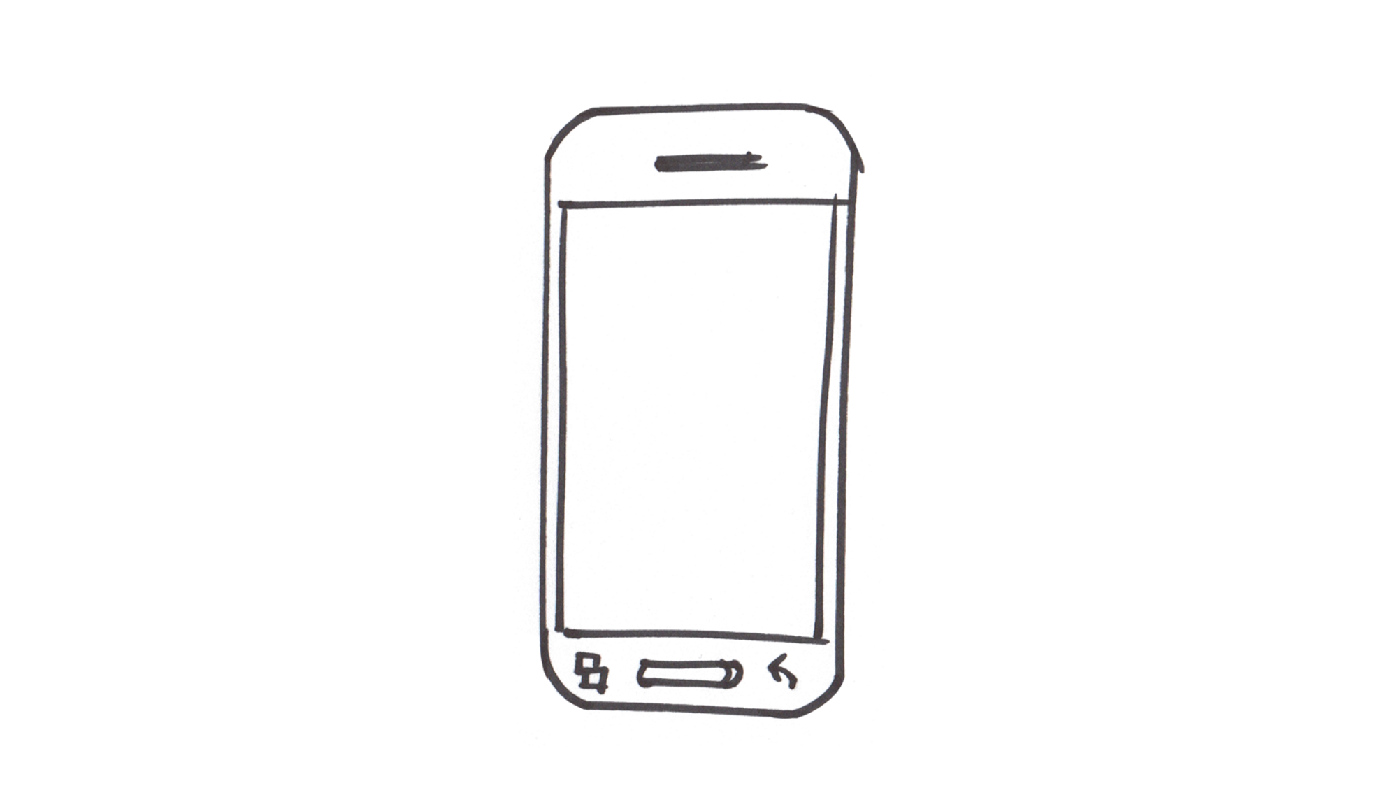
Android phones can look like anything, but you know an iPhone when you see one.
Here’s Samsung’s Galaxy S8 next to LG’s V30 smartphone.

They are nearly identical from the front. Philippe Starck, an industrial designer, opined that bezel-less phones mark the end of phone design. He’s right. There’s a lot less to design now.
So what happens when the iPhone’s home button disappears? The iconic iPhone silhouette also disappears.
Then there’s the other problem of the front-facing camera and FaceID.They still need to be in front and they aren’t ever going away — we will always have front-facing cameras.
How do you solve these two problems? Design is all about compromises and managing tradeoffs. And the notch is definitely a tradeoff. It’s there because we need space for cameras and sensors.
But here’s the thing: the notch solves the all-bezel-less-phones-look-the-same problem. They’ve created the new iconic iPhone silhouette. Apple has managed to turn an undesirable tradeoff into an elegant solution. That’s incredible.
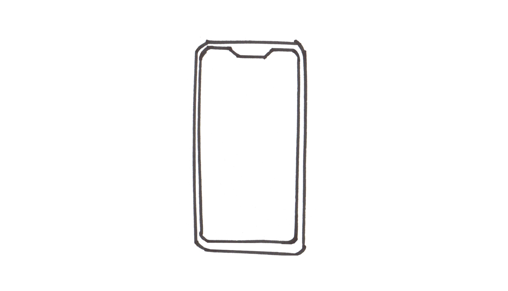
So a few years from now when you ask a stranger to draw an iPhone, they won’t be drawing this, or this:
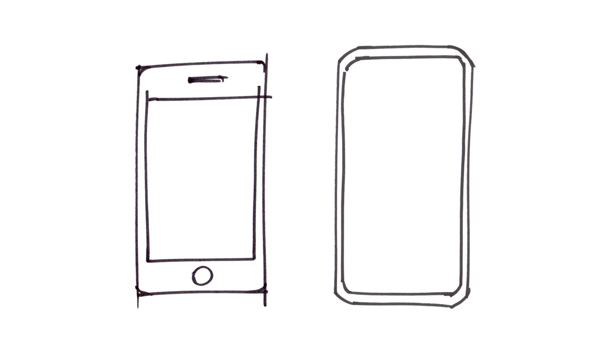
They’ll be drawing this: